'%3e%3cmask%20id='mask0_5026_104'%20style='mask-type:luminance'%20maskUnits='userSpaceOnUse'%20x='0'%20y='-1'%20width='163'%20height='28'%3e%3cpath%20d='M0%20-0.149841H162.36V26.9102H0V-0.149841Z'%20fill='white'/%3e%3c/mask%3e%3cg%20mask='url(%23mask0_5026_104)'%3e%3cpath%20d='M0%20-0.149841H81.18V13.3802H0V-0.149841Z'%20fill='%232E2E2E'/%3e%3cpath%20d='M13.5246%2013.3802V-0.149841H-0.00537109V13.3802H13.5246Z'%20fill='%232E2E2E'/%3e%3cpath%20d='M27.0493%2013.3802V-0.149841H13.5193V13.3802H27.0493ZM40.5955%2013.3802V-0.149841H27.0655V13.3802H40.5955Z'%20fill='%232E2E2E'/%3e%3cpath%20d='M54.1201%2013.3802V-0.149841H40.5901V13.3802H54.1201Z'%20fill='%232E2E2E'/%3e%3cpath%20d='M67.6447%2013.3802V-0.149841H54.1147V13.3802H67.6447Z'%20fill='%232E2E2E'/%3e%3cpath%20d='M81.1692%2013.3802V-0.149841H67.6392V13.3802H81.1692ZM27.0708%2013.3802H54.1308V26.9102H27.0708V13.3802Z'%20fill='%232E2E2E'/%3e%3cpath%20d='M40.5954%2026.9102V13.3802H27.0654V26.9102H40.5954Z'%20fill='%232E2E2E'/%3e%3cpath%20d='M54.1201%2026.9102V13.3802H40.5901V26.9102H54.1201ZM108.259%20-0.149841H135.319V13.3802H108.259V-0.149841Z'%20fill='%232E2E2E'/%3e%3cpath%20d='M121.784%2013.3802V-0.149841H108.254V13.3802H121.784Z'%20fill='%232E2E2E'/%3e%3cpath%20d='M135.308%2013.3802V-0.149841H121.778V13.3802H135.308ZM81.1909%2013.3802H108.251V26.9102H81.1909V13.3802Z'%20fill='%232E2E2E'/%3e%3cpath%20d='M94.7155%2026.9102V13.3802H81.1855V26.9102H94.7155Z'%20fill='%232E2E2E'/%3e%3cpath%20d='M108.24%2026.9102V13.3802H94.71V26.9102H108.24ZM135.308%2013.3802H162.368V26.9102H135.308V13.3802Z'%20fill='%232E2E2E'/%3e%3cpath%20d='M148.833%2026.9102V13.3802H135.303V26.9102H148.833Z'%20fill='%232E2E2E'/%3e%3cpath%20d='M162.357%2026.9102V13.3802H148.827V26.9102H162.357Z'%20fill='%232E2E2E'/%3e%3c/g%3e%3c/g%3e%3cdefs%3e%3cclipPath%20id='clip0_5026_104'%3e%3crect%20width='165'%20height='28'%20fill='white'/%3e%3c/clipPath%3e%3c/defs%3e%3c/svg%3e)
Vori Health Website
Designing a Seamless Healthcare Experience
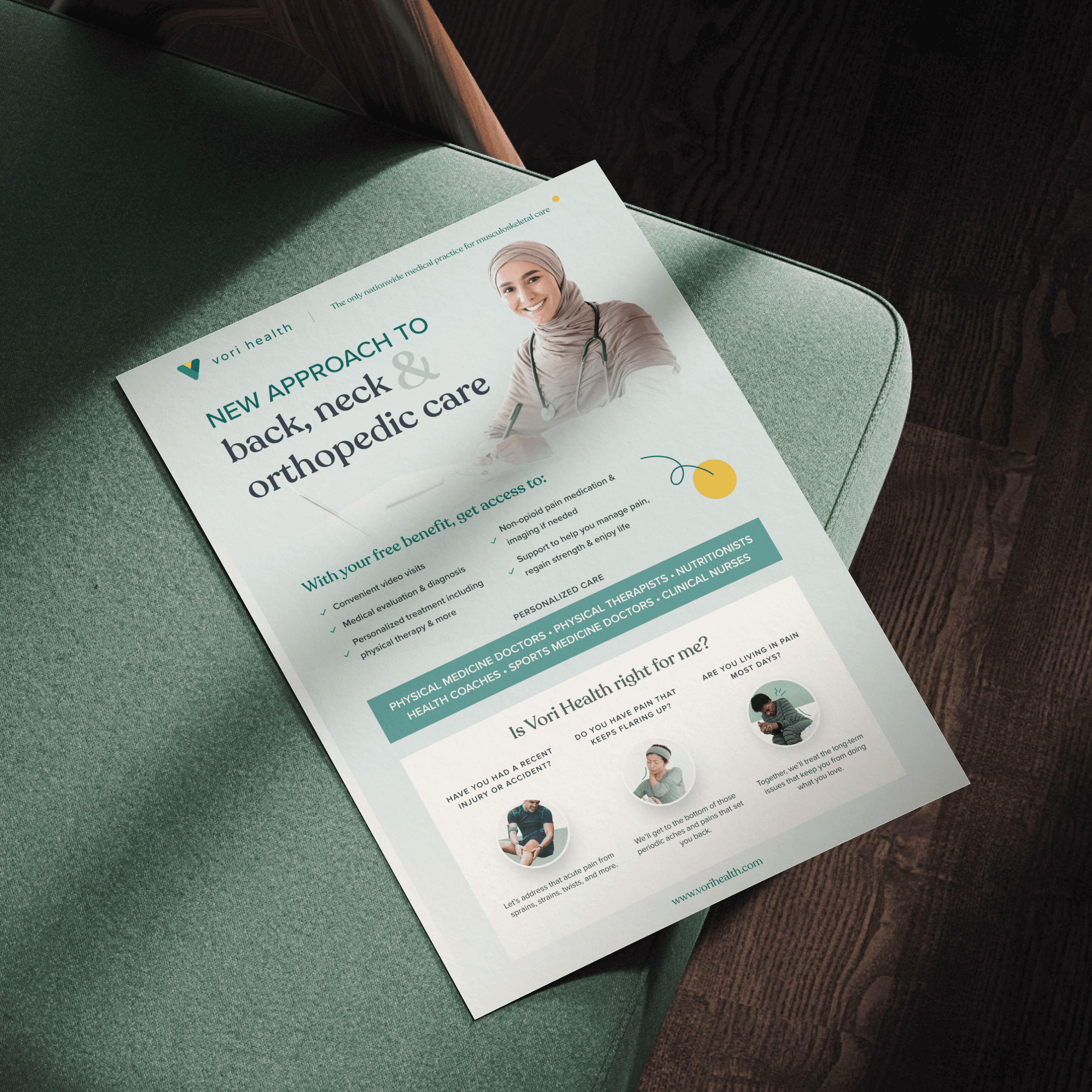
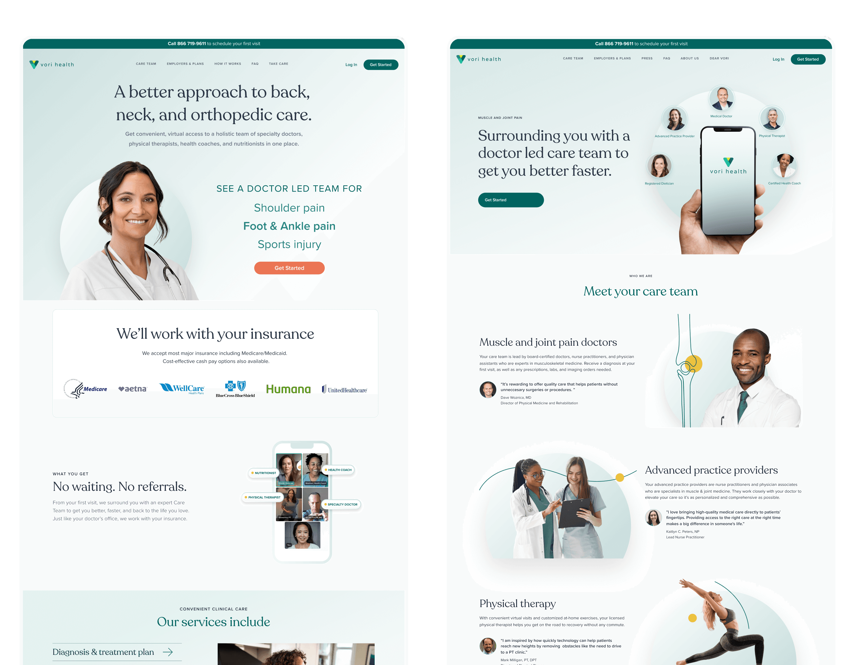
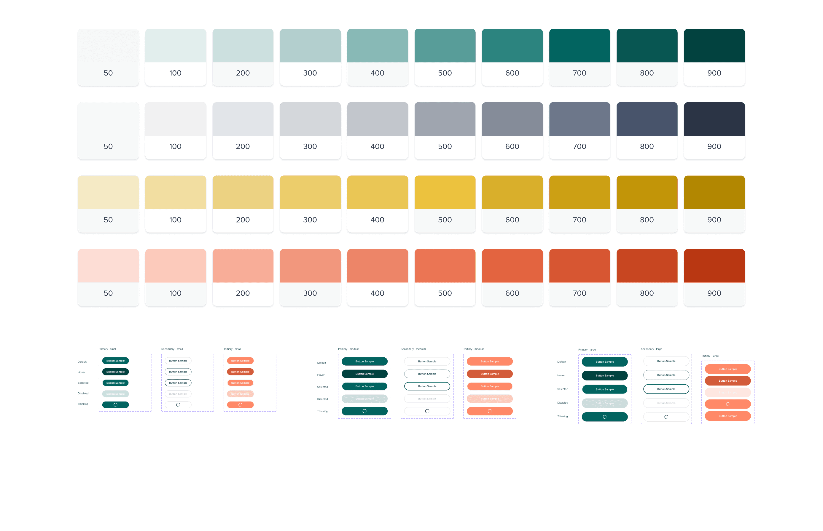
As Visual Designer for Vori Health, the goal was to redesign the website in a way that aligned with an existing product design system — without compromising visual clarity or brand consistency. Working within the framework of a previously established product UI, a parallel system was developed specifically for the website to ensure both cohesion and flexibility. The focus was on creating a user-friendly, conversion-driven experience that made Vori's medical services feel approachable, trustworthy, and easy to access.
Industry
Telehealth / Digital Healthcare
Scope of work
/ Web design / Branding / UI/UX Design / Visual Design
A Site That Builds Confidence and Encourages Action
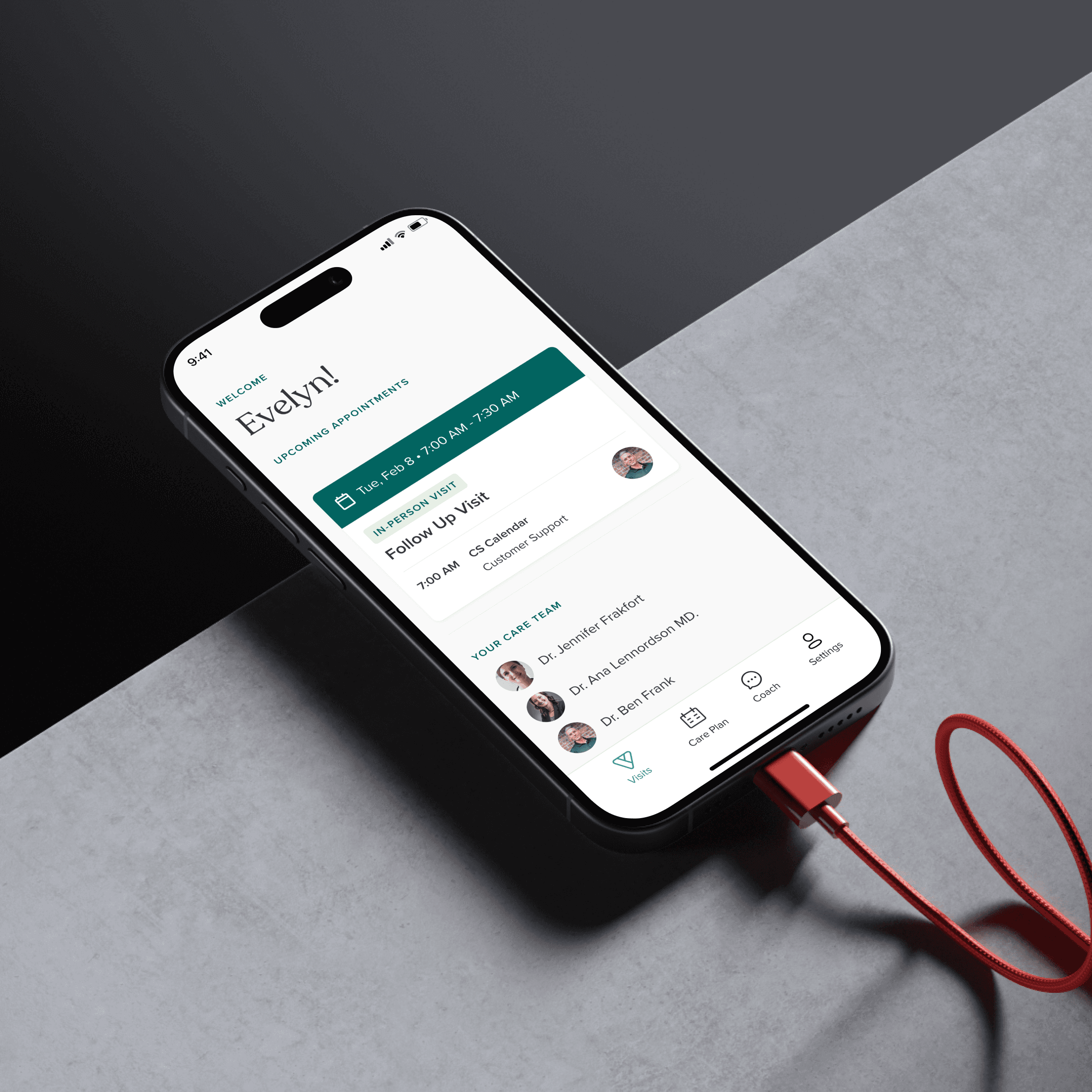
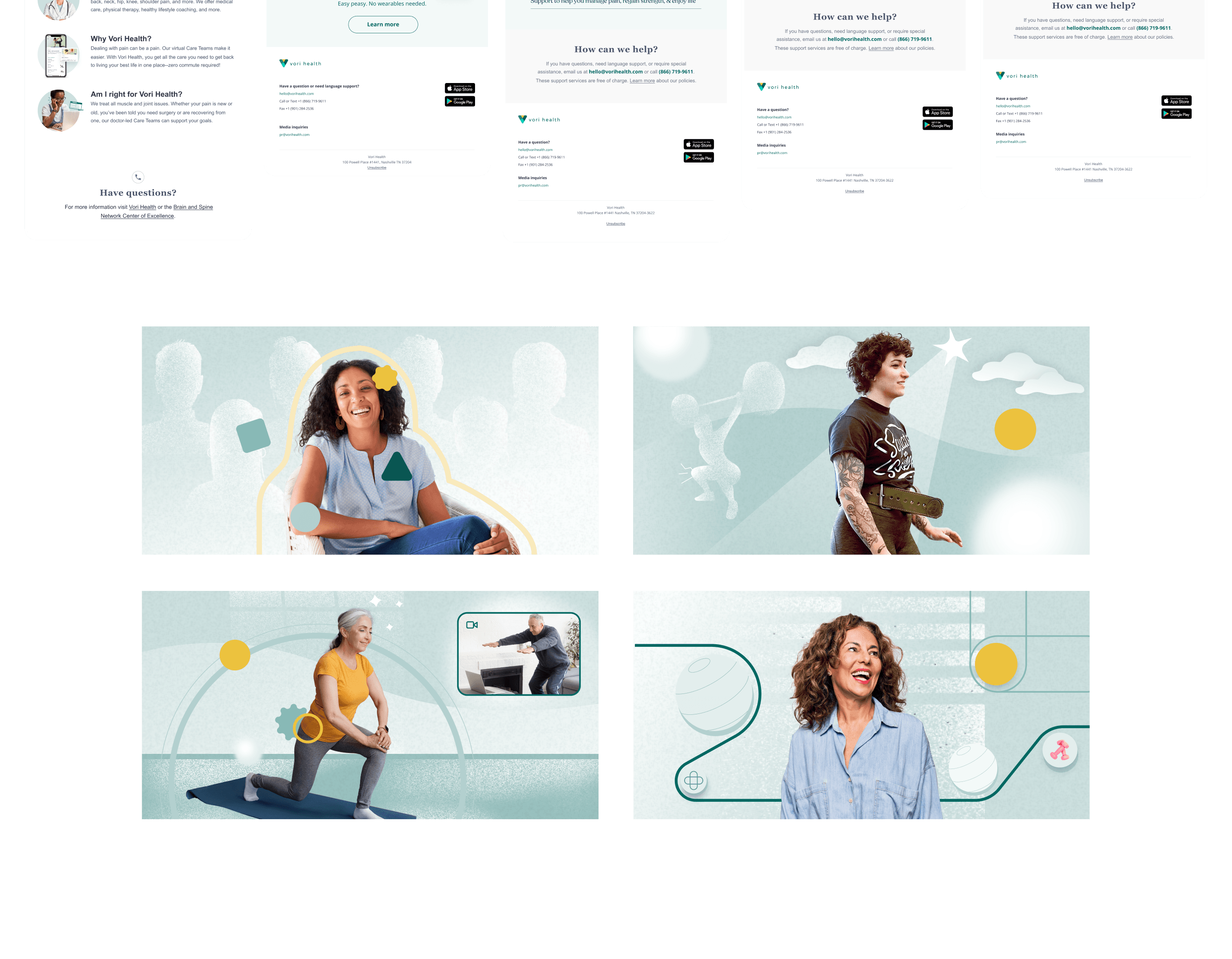
The redesign focused on usability, clarity, and conversion. User interviews revealed that many patients struggled to find accessible care and felt overwhelmed by referrals and complex healthcare systems. This insight drove key layout decisions: important information was brought forward, jargon was minimized, and the value proposition was distilled into plain, welcoming language. A visual hierarchy was established to help users instantly grasp the benefits of Vori's virtual-first care — connecting with doctor-led teams, skipping referrals, and accessing treatment from home.
The layout was simplified and structured to reduce friction and help users take action with ease.
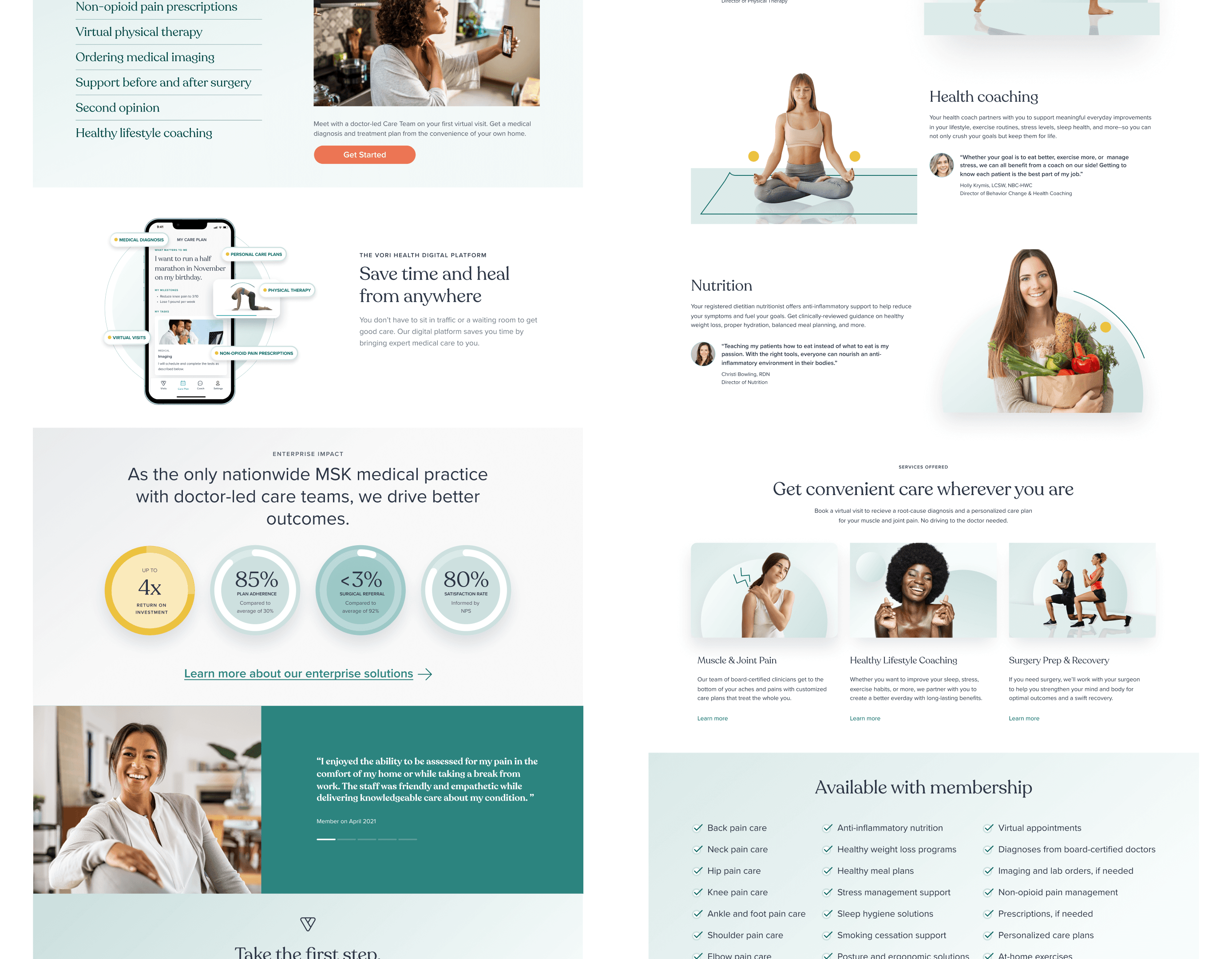
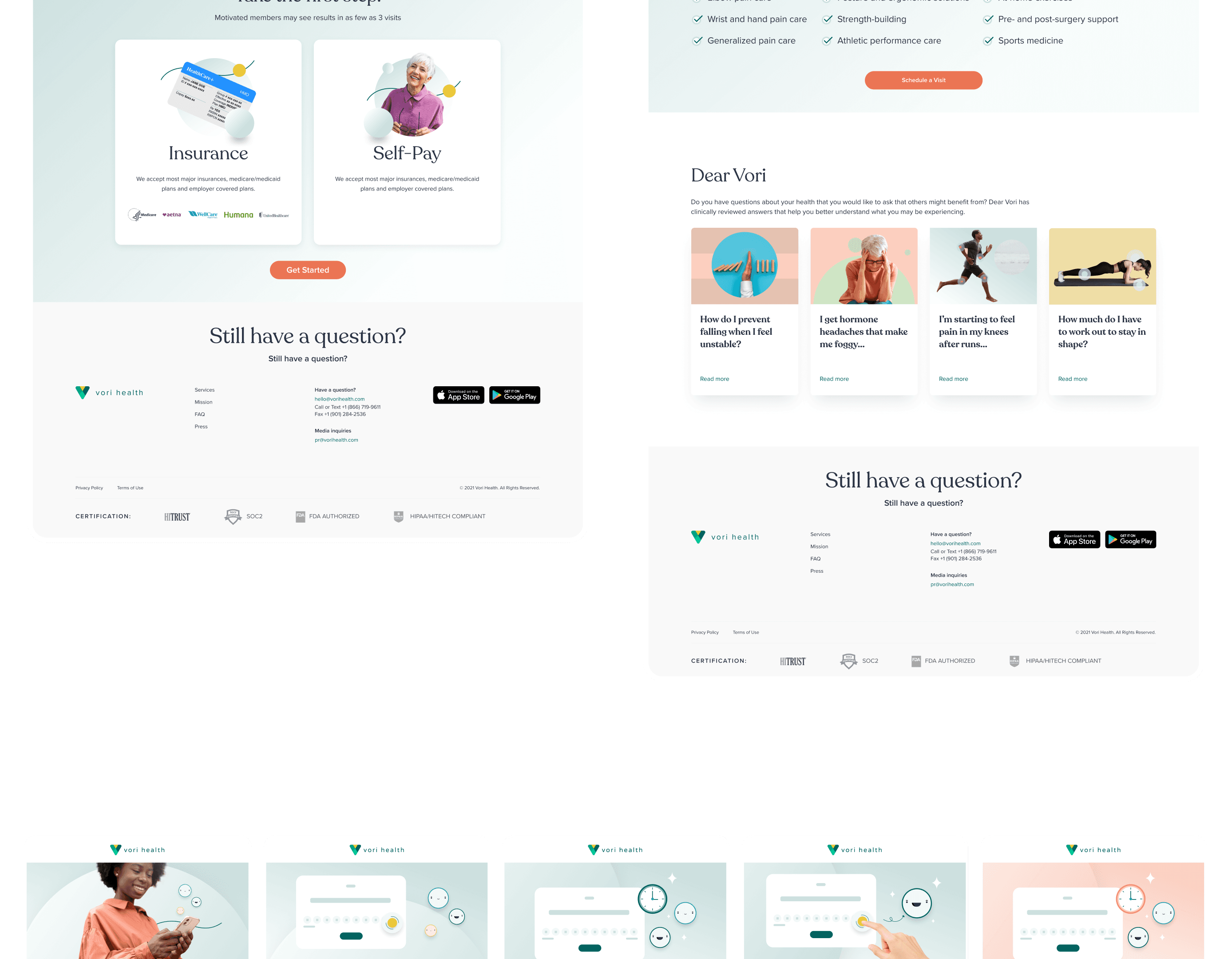
Clarity, Trust, and Scannability at Every Step
Key service offerings — such as virtual physical therapy, diagnostics, and pre/post-surgery support — were featured in clean, easy-to-read modules. Insurance options and payment transparency were emphasized early in the page flow, building trust with new users. Bright, modern visuals and curated testimonials reinforced brand credibility while helping humanize the care experience. Additional UX improvements, like streamlined navigation and bold CTAs, ensured users could quickly reach what they needed — whether it was booking care, exploring enterprise solutions, or downloading the app.
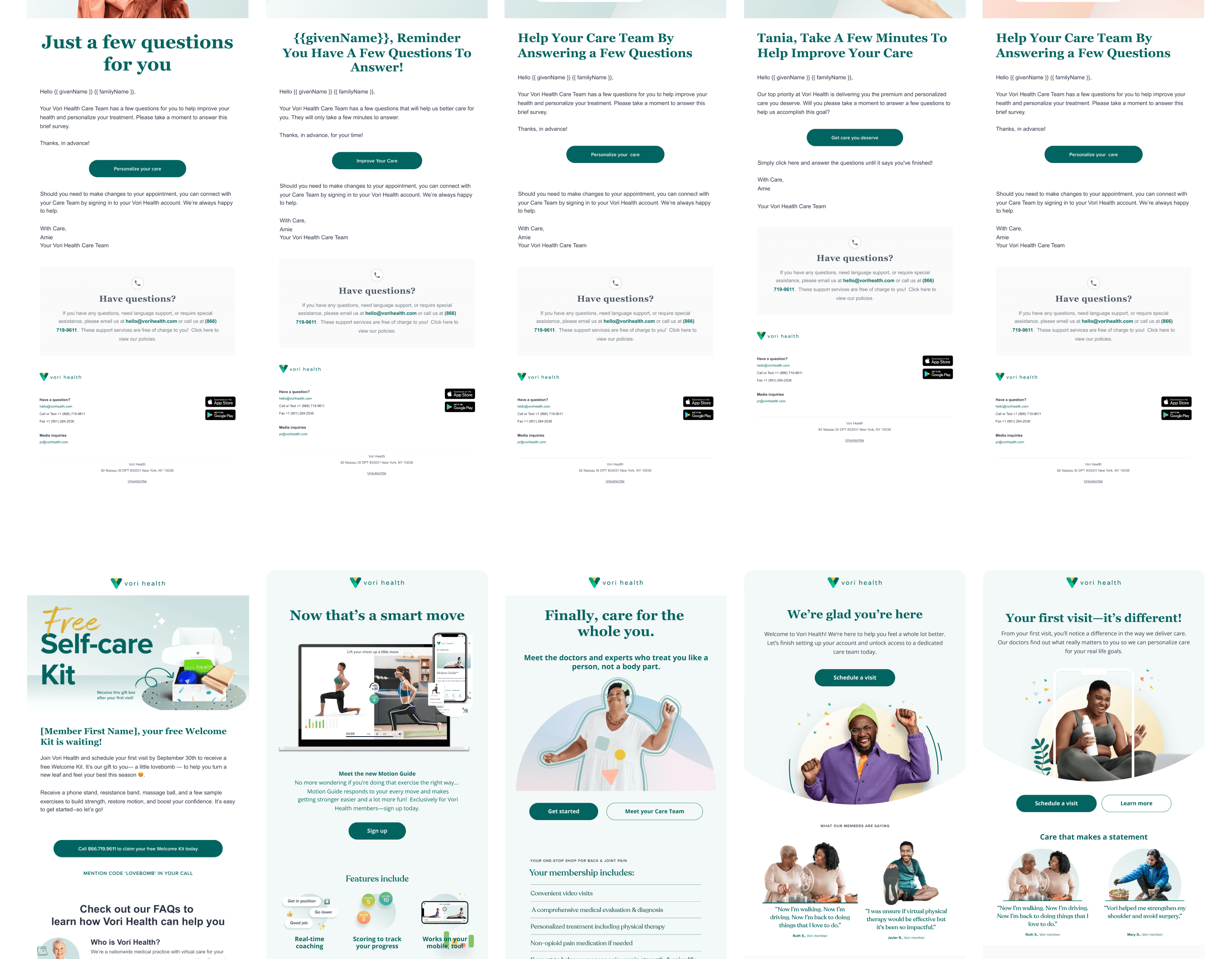
Every page was designed to work for patients, providers, and partners alike — clearly, confidently, and without confusion.